Big Hit Studios is a kickboxing and fitness studio with multiple locations in the Greater Toronto Area. With a variety of challenging and exciting classes, Big Hit provides a refreshing way to improve your health and fitness.
I was part of a two-man team responsible for a complete rebranding of the company as well as an overhaul of Big Hit’s website. We created and presented all major deliverables from scratch.
Users
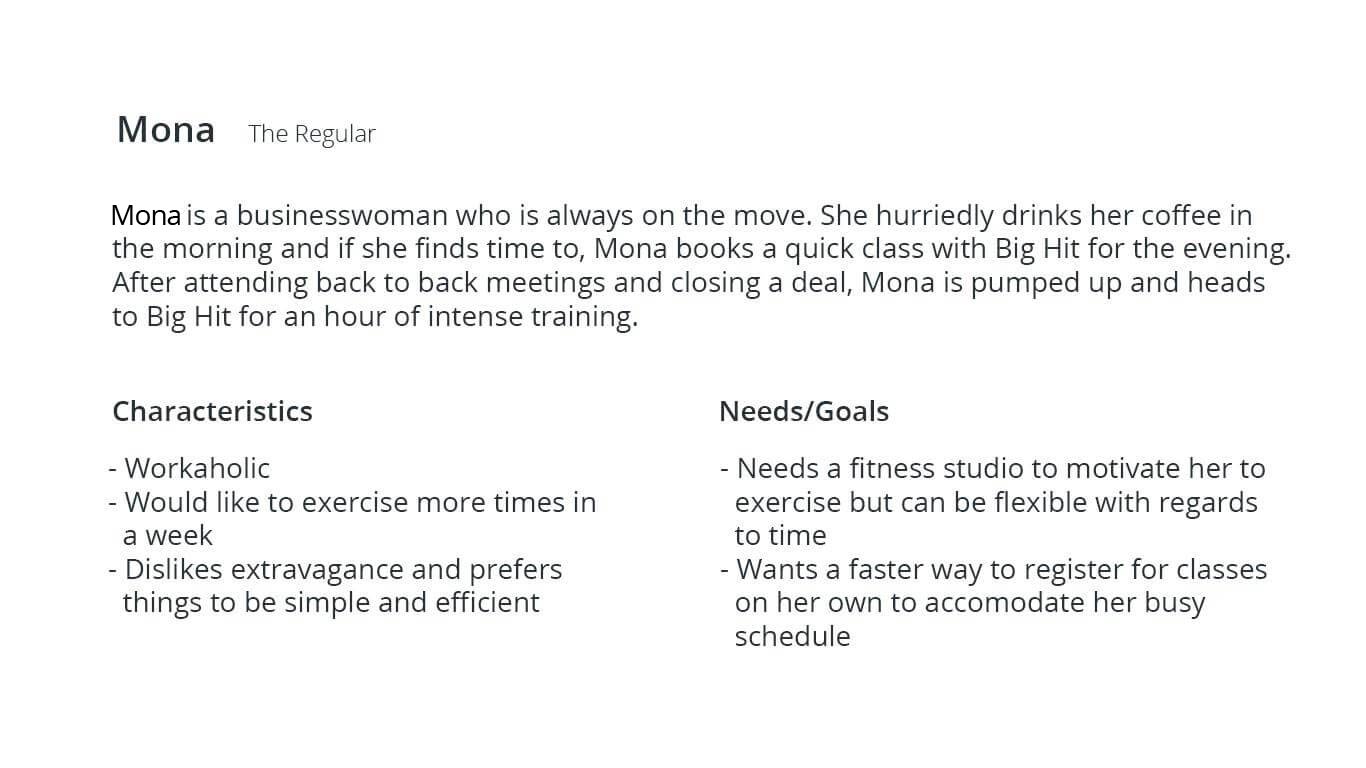
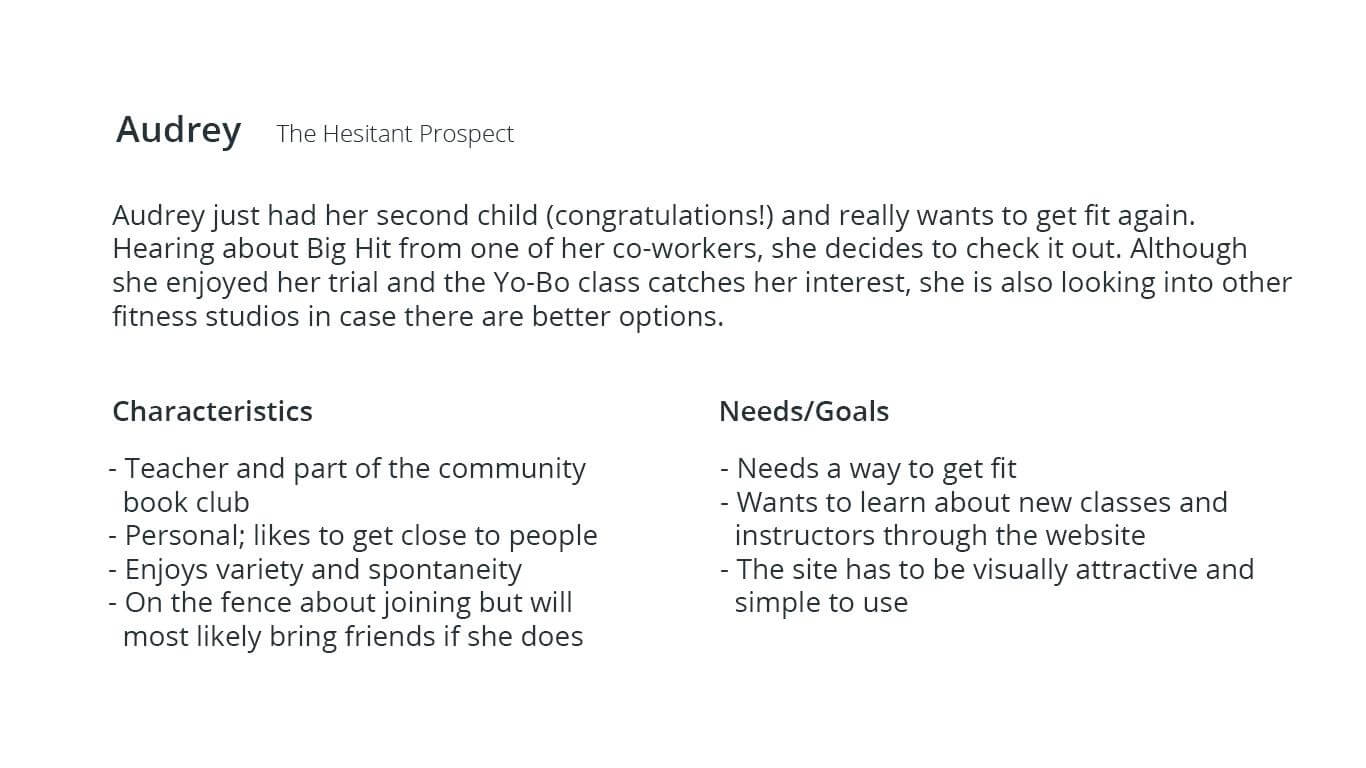
Given creative freedom with very loose guidelines, it was imperative that we understood the target demographic. We started off by sending out a short Typeform survey to 150 random Big Hit students.
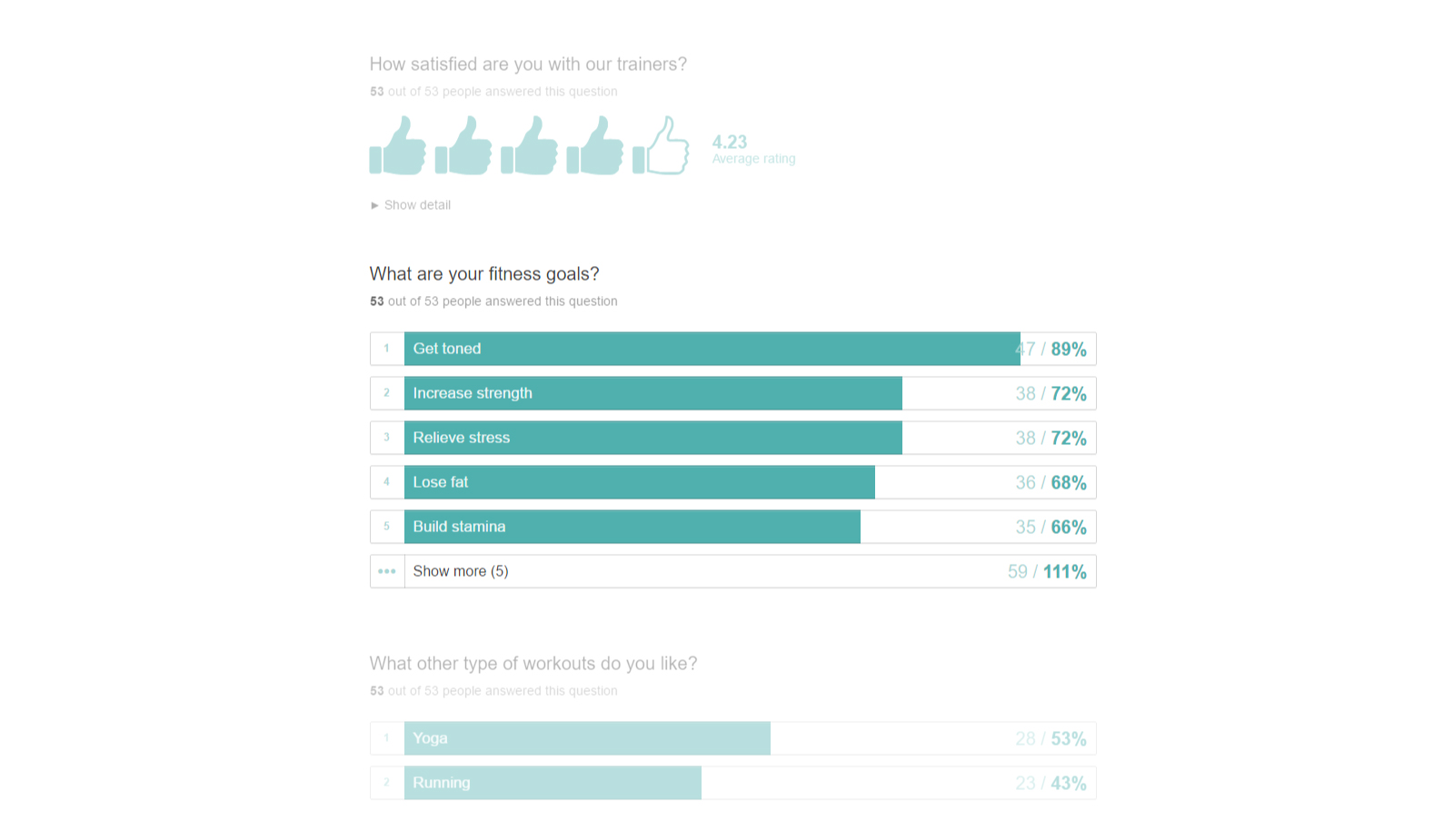
Although we didn't get as many results as we had hoped, the survey was great as a starting point for gathering general user data, such as age, gender, fitness goals, and social media presence. However, this only skimmed the surface. We needed to go deeper in order to understand exactly what people expected and wanted to see in the new website.
Over a week, we asked several clients what they thought about the current state of Big Hit Studios, and how they use the website.
Competition
We also conducted some competition research to get a feel of the industry and how other fitness studios presented themselves on the web. We looked at 5 competitors that offered similar products to Big Hit and found that most businesses had more or less the same barebones information on their websites: a short introduction of the studio followed by descriptions of different classes, several pricing models, contact information and occasionally a blog.
With these as the basic requirements for our new design, we wanted to include a feature that would set Big Hit apart from the competition. As a rapidly growing studio with over 200 customers and a small staff, it would become increasingly difficult to manage each instructor's schedule without some sort of automated booking system.
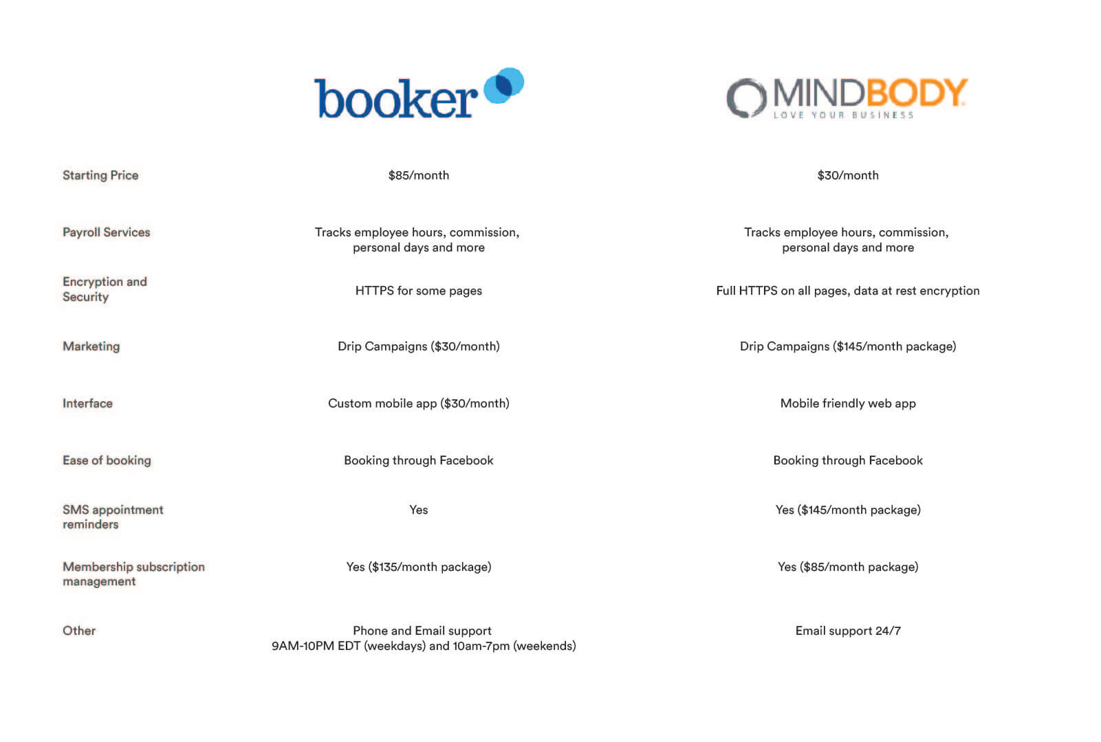
Booker offers a full suite that handles everything from scheduling to POS at a much cheaper rate than MINDBODY. Although this seemed like an easy choice at the time financially, MINDBODY had a few advantages over Booker that caught the client's interest, including the ability to have subscriptions and memberships, and a whole suite of mobile friendly widgets.
Of course, it was ultimately a business decision that Big Hit would make no matter how much we favoured one system or the other. When we approached them with the idea of adding a booking system directly into their website, we were met with enthusiastic replies. After testing out both products with the client and much debate, we decided to use MINDBODY mainly due to it's customizability.
Visualize
After completing most of our research, we started to sketch out what we wanted to build. Our first iteration was extremely straightforward: a single page site that incorporated a floating button to pull out the scheduling interface.
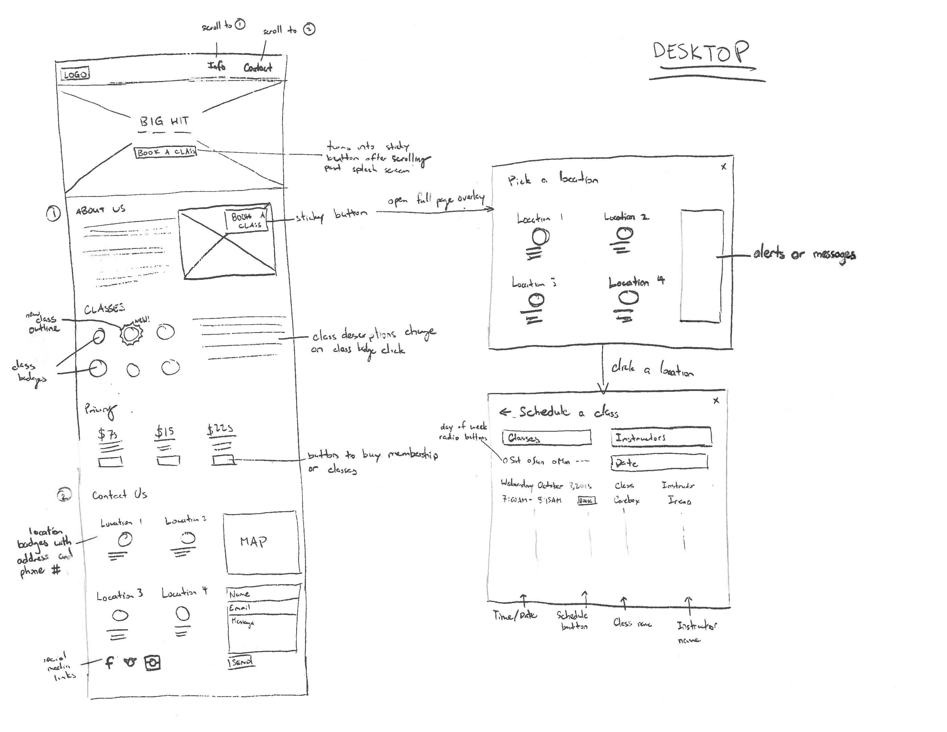
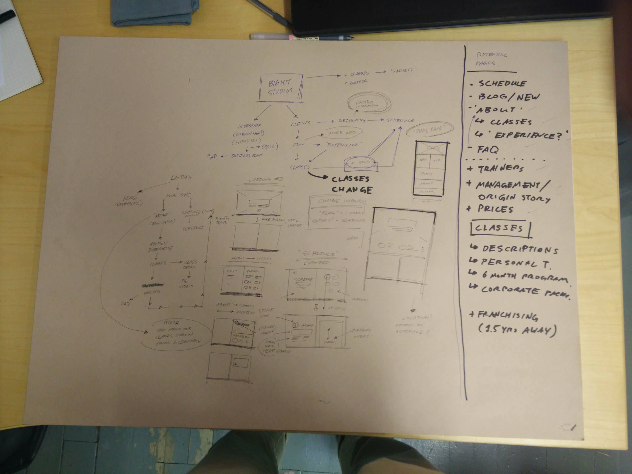
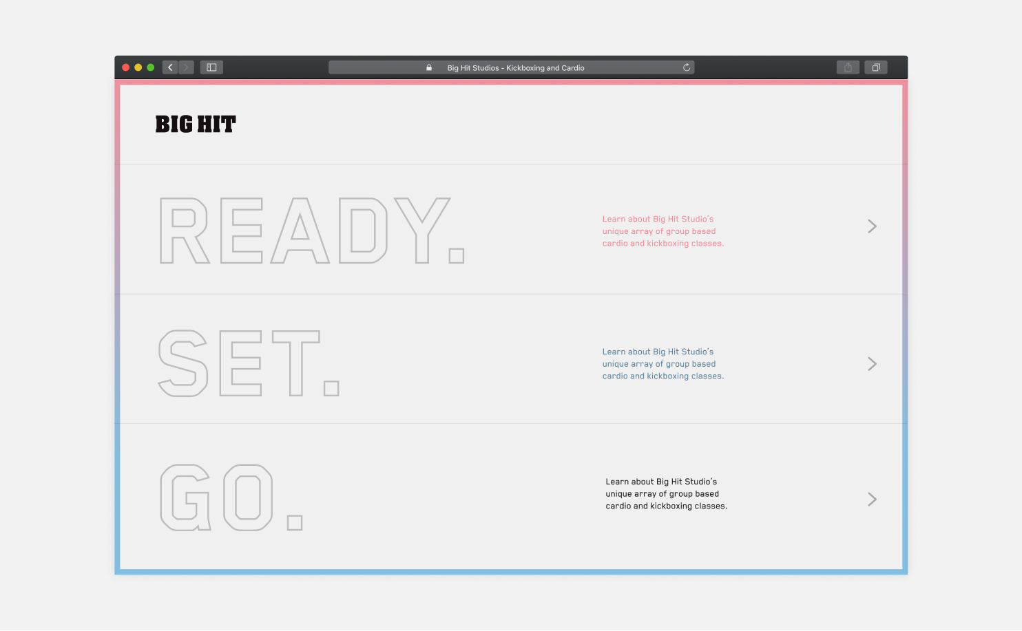
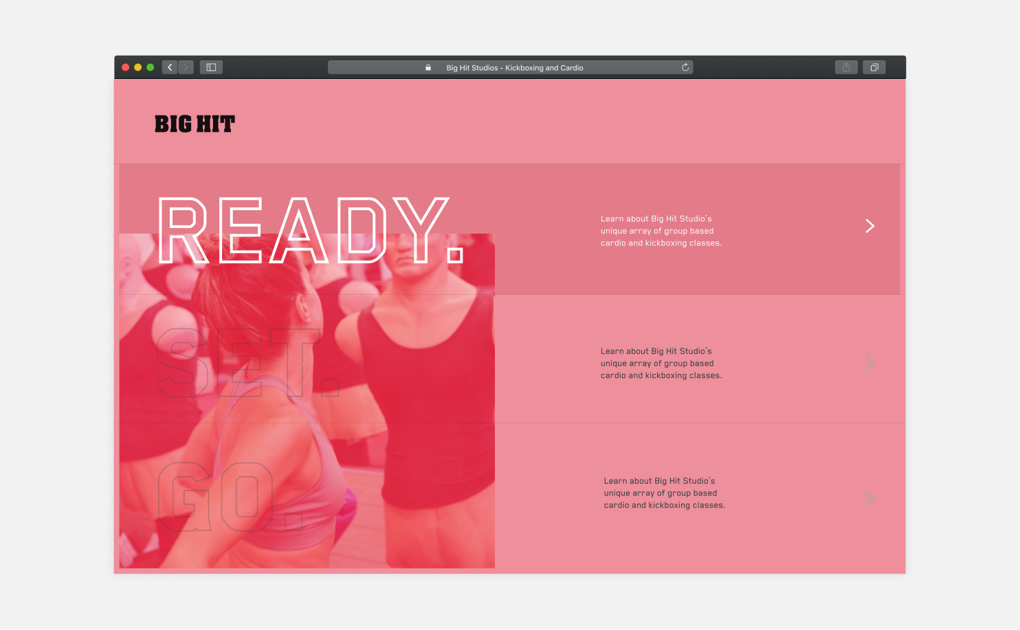
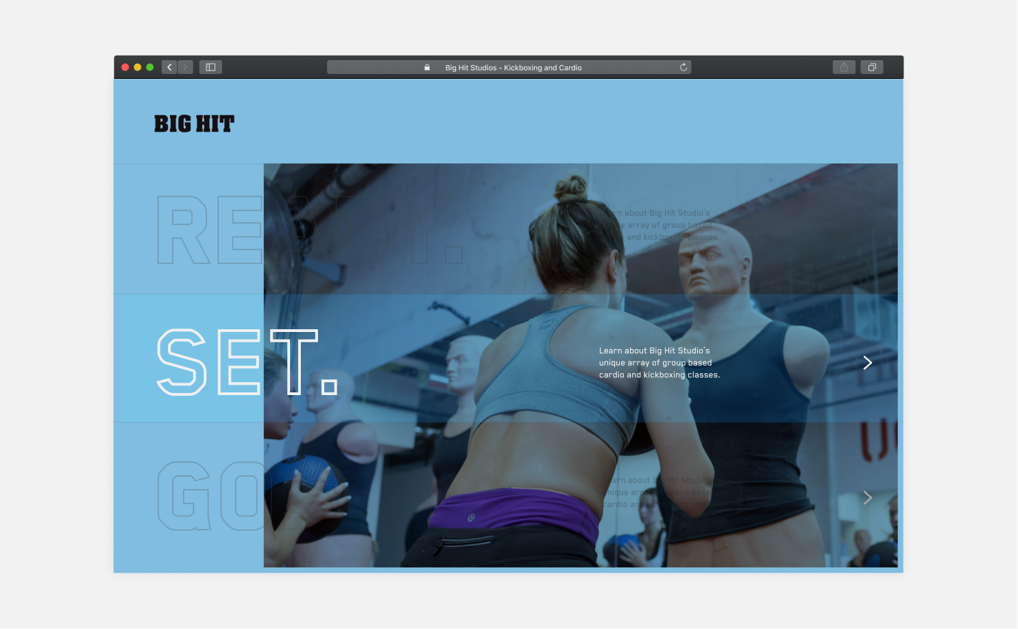
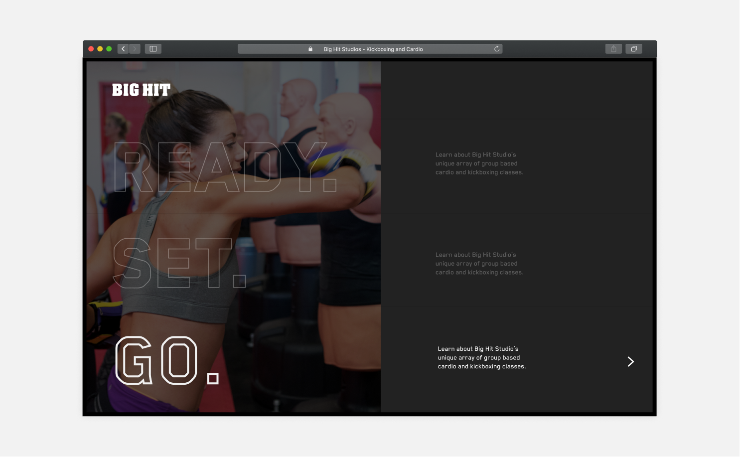
We felt that this did not place enough emphasis on scheduling, which was one of the main improvements that we wanted to focus on. The second design was centered around the phrase 'Ready, Set, Go' - we assigned navigation to each word of the phrase.
Identity
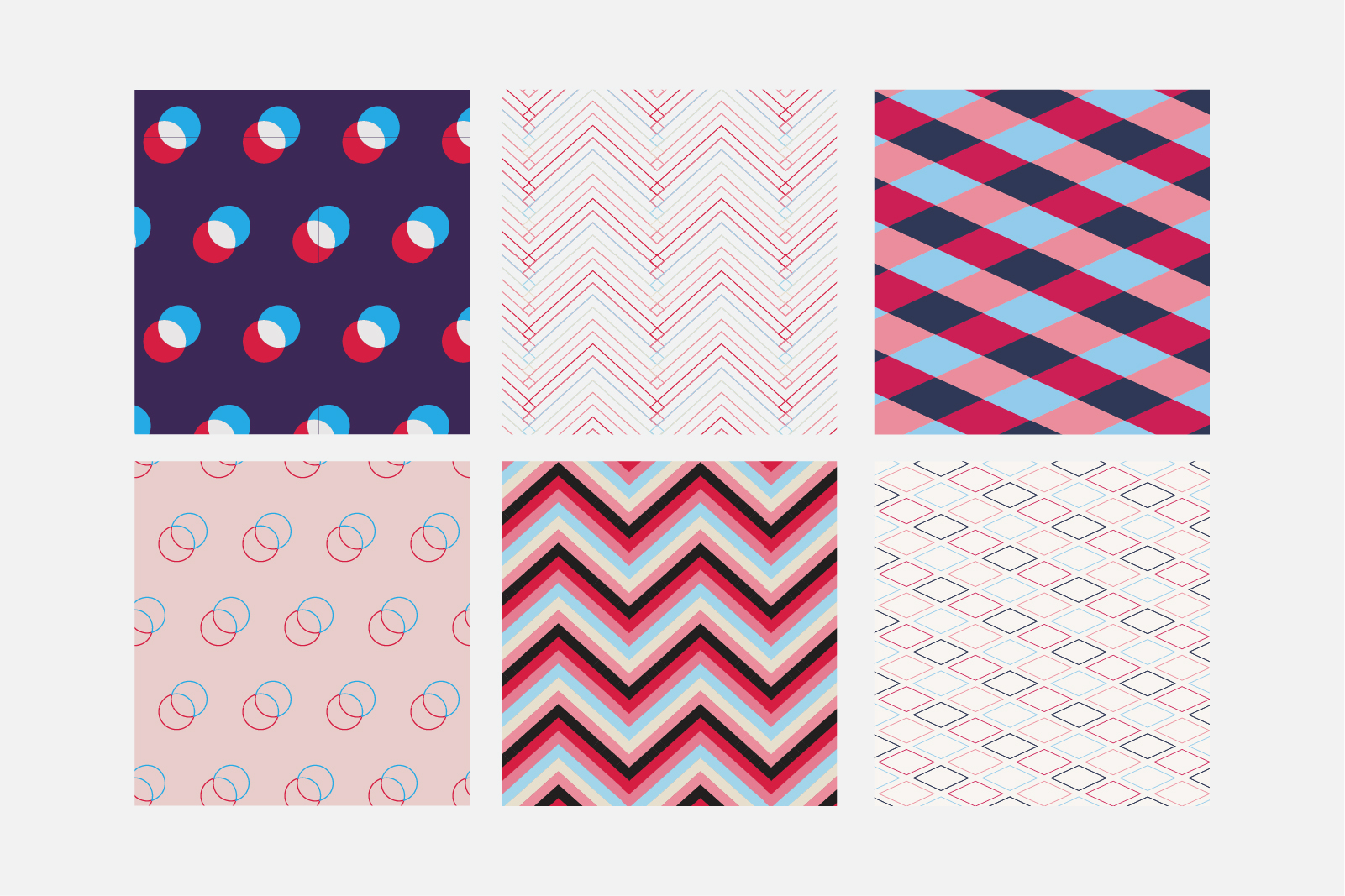
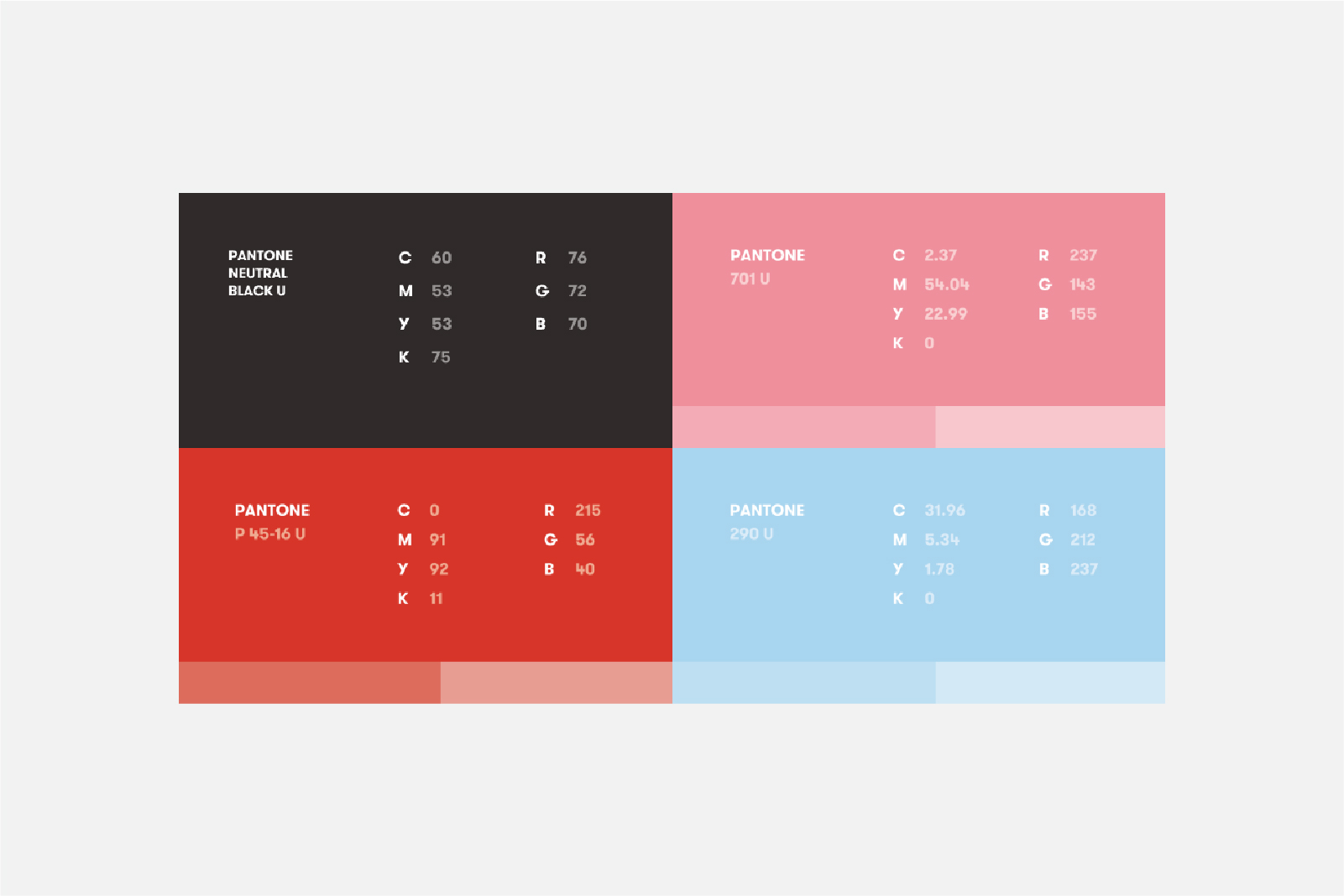
While the iteration and testing process was ongoing, we started to brainstorm ideas for Big Hit's new identity. Referring back to our research, we took into account the high percentage of female members and revised the colors to a "cotton candy" color scheme of light pastel tones. Bold, strong fonts were chosen to emphasize the intensity and impact of Big Hit's classes.

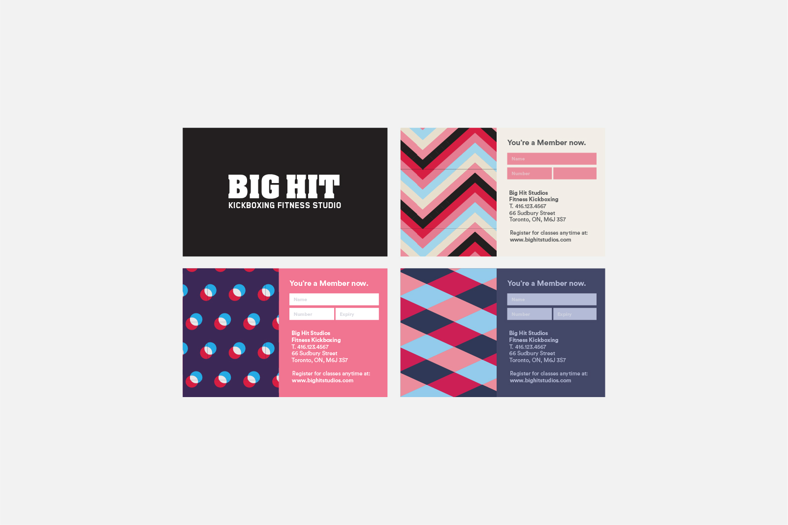
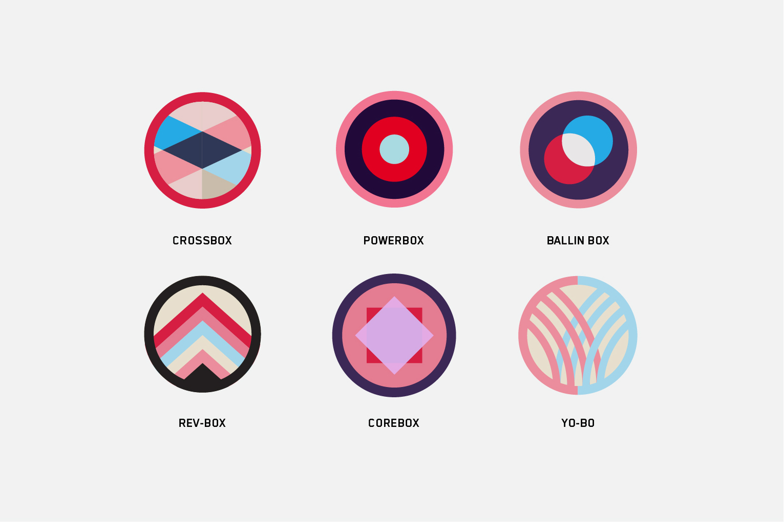
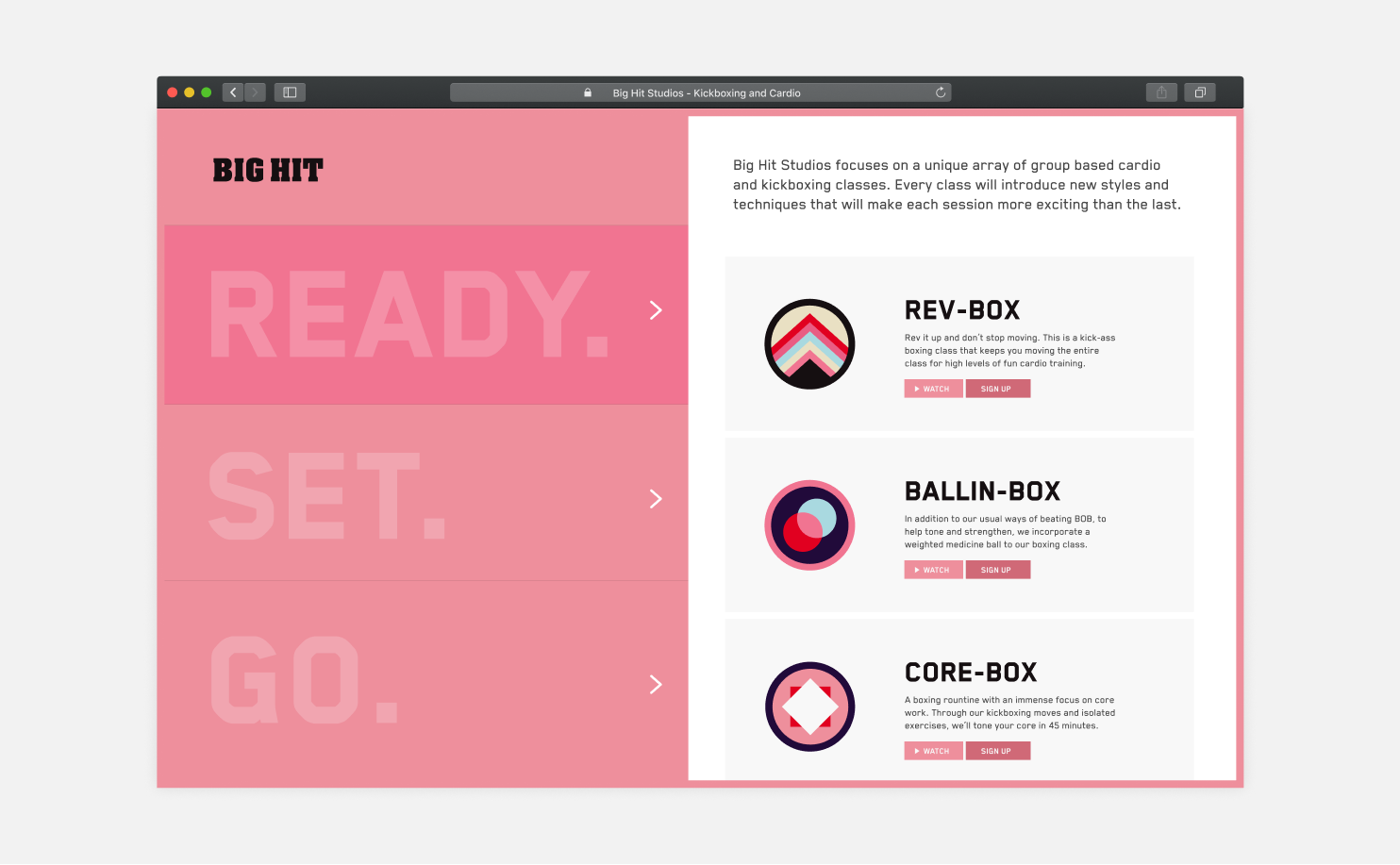
Big Hit's biggest differentiator from its competition was the assortment of unique classes that it offered compared to the competition. We decided to better emphasize these classes by creating individual patches and explanatory videos, so that each classes would be unique from the others.
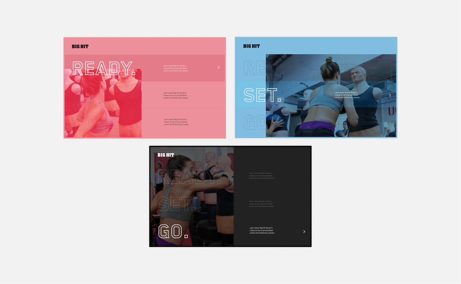
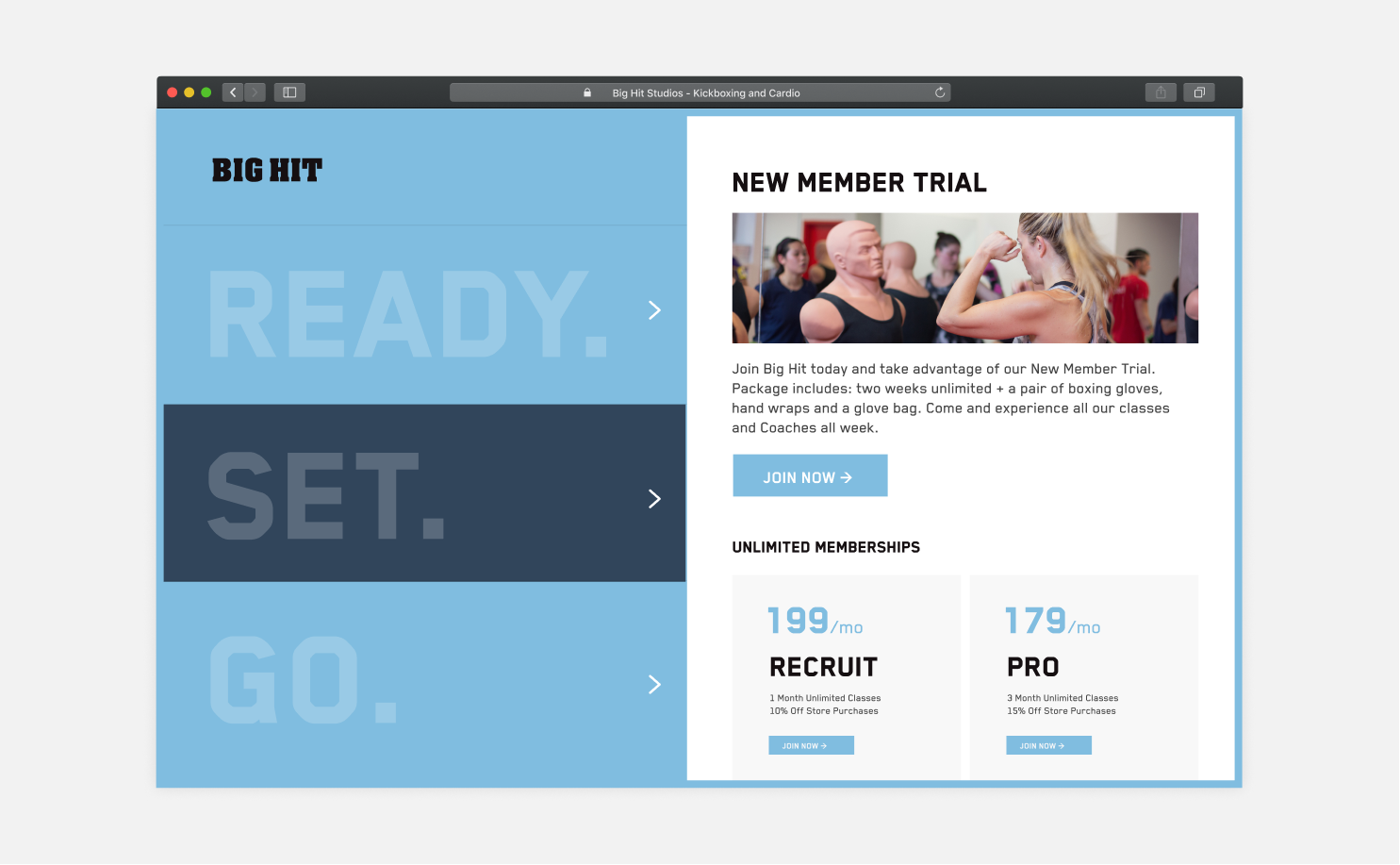
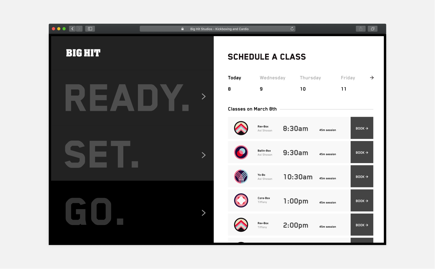
Big Hit's final website design features a horizontal split layout that puts equal emphasis on new and returning students.
The READY and SET panel contains information on Big Hit's class offerings, short blurbs of various instructors, and a generic "who we are" section. For new clients, this is the section that they will be focused on.
The GO panel leads to an embedded scheduling system supplied externally for both new and returning students to book their classes online.
Late in the process, the owners were worried that the layout proposed would lead to more bounces and fewer new sign ups. They also acknowledged that encouraging existing customers to sign up for more sessions would lead to much higher retention, leaving them unsure of what direction to take.
We used a quick 2 month A/B experiment to test our new layout against a more traditional page that included scheduling as a link in the top nav. As a result, we found that new customer signups were similar for both, but there was a 19% increase in returning customers on our proposed layout.